Morning Colors: The Inspiration behind the series
In this painting series, I set out to examine that relationship to morning through a place which is no stranger to dawn.

Questioning my sanity at 6 am on a 20 degree morning run a few months ago [December 2024]
I am a former midshipman and surface warfare officer - but now I am a civilian, mother of three, adjunct art professor, and freelance artist. My relationship to mornings has changed over the years, and that is never more apparent to me than when I visit Annapolis.
The Naval Academy experience is as formative as it is rigorous, and waking up early within that environment is a non-negotiable part of daily life. Midshipmen are up for military obligations, workouts, and squeezing out more ounces of productivity. But there are other reasons people may be awake in Annapolis: reflection, meditation, care taking, movement, travel, work, anxiety (I know I’m not the only one ;)…
Keep reading for the story of how this series was created, as well as a full preview of the works.
but first… what to expect:
The collection launches to the public on March 25, 2025 at 12 pm EST (9 am PST) exclusively online at www.easelonstribling.com.
Prints will be available after the launch.
Commission Policy: I will not be accepting commissions for this series at this time. (If you’re interested in custom work, I can provide referrals through trusted contacts!)
Stay Connected: For any questions or further details, please reach out at hello@easelonstribling.com.
The Story Behind “Morning Colors”
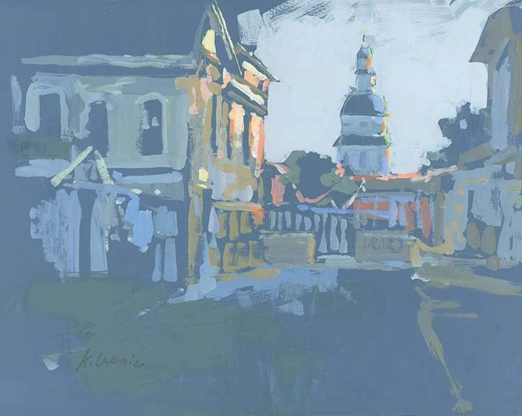
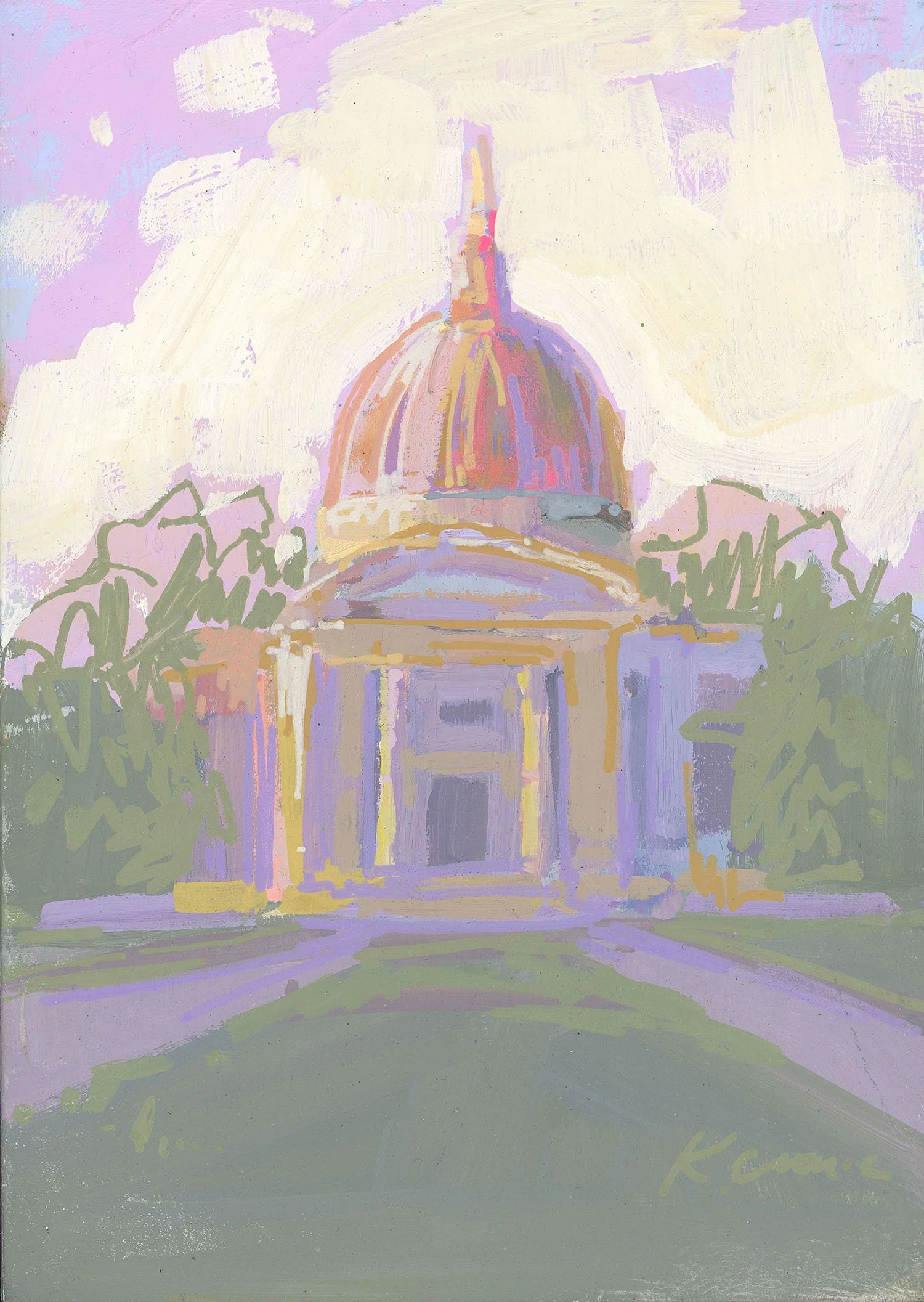
I wanted to celebrate the colors and the light- regardless of why someone may be awake, the reward is the same. What I discovered was a literal sunrise was only a small part of the story. There’s a feeling in the colors- soft, nuanced, and gray.
A Personal Spark & The Creative Process

My journey with Morning Colors began when my youngest was just a few weeks old. I was enrolled in an online color theory workshop where we explored how colors communicate different moods based on the time of day. I learned that:
On a cloudy day, colors are deeply saturated with minimal contrast.
In the afternoon on a sunny day, light and shadow create vivid dynamics, but color is usually washed out in response to harsh light.
In the morning, however, colors tend to run in a tight value (or, how light or dark something is) range—with whites resembling light grays and darks softening into gentler tones.
Lightbulb moment! It was March of 2022, and I knew I had to explore this. I just had a newborn and a book to publish first, so… hold that thought :)
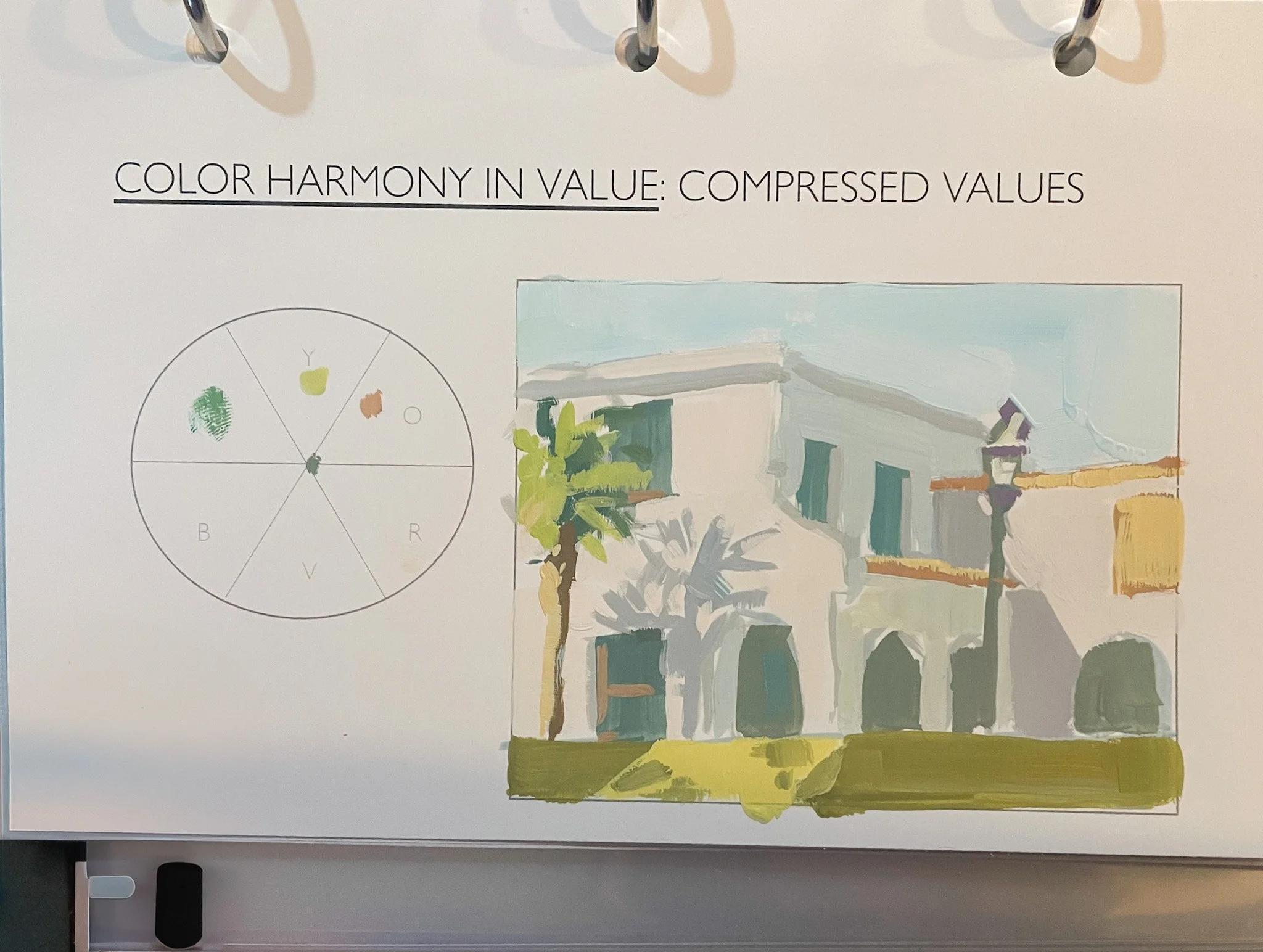
A page from Scott Gellatly’s “Color Theory for Painters” workshop. Learn more about his classes, see the bottom of this post.
From Theory to Practice:
This revelation inspired me to capture the subtle, delicate hues of early dawn. I collected photos over the years, squirreling them into an album for the right moment. I spent hours poring over photos and experimenting with different studies—each a small attempt to translate that unique morning light onto canvas.

first painting…
This oil painting of the Vice Admiral William Porter Lawrence statue was the first completed. I painted it over the course of many months, picking it up in quiet moments.
The Messy Middle & Finding Clarity:
As with any creative journey with an open ended prompt, the process took turns:
I started with a burst of energy and many promising ideas—sometimes even developing threads that could have become separate series (more on that later).
I experimented with new techniques, even incorporating paint pens to introduce unexpected lines and textures.
After a period of creative overwhelm—what I’d call the “pit of despair”—I learned to narrow my focus and return to the original intent: a celebration of the colors at dawn as experienced during a morning walk in Annapolis and at the US Naval Academy. Some of those tangents are included in the final series, as they are part of the process.
Some paintings take “dawn” with creative license, referencing a different time of day but holding the quiet spirit morning offers.

After that first, piece, I set out to play at a smaller scale with color studies. These are 8”x8” and 5”x7” paintings.
The Essence of Morning Colors
Capturing a Ritual
While the palette is subtle, the theme is rich. The term “Morning Colors” isn’t just about hues—it’s also a nod to the daily military tradition of the flag-raising ceremony.
• This ritual, full of hope and resilience, represents a communal moment of reflection that resonates deeply with my own experiences as a midshipman.
• It’s a moment of pause—a brief interlude before the day’s rush—that holds both intimacy and promise.
• Light, Value, and Emotion: By working within a tight value range, I’ve given the soft grays of dawn room to express emotion. This process allowed me to focus on conveying the fleeting, delicate beauty of a morning.
Looking Ahead: Future Series & Projects
I referenced the overwhelm that came midway through this series. The “aha” moment was that I was actually working with the seeds of new bodies of work, and finally figuring that out allowed me to narrow my focus. I moved the pieces in these ideas out of my line of sight for a few days in order to finish the series, but am including them in this launch because they represent part of the process.
Navy Rowing Series:
I’m already excited about this new series that captures the strength and unity of rowing at USNA.
Architecture (again!)
Inspired by these two pieces, I plan to explore architecture with less detail and more emphasis on atmospheric color in a fresh and exciting way.
These felt like a breakthrough, until I realized I’ve played with this idea before….
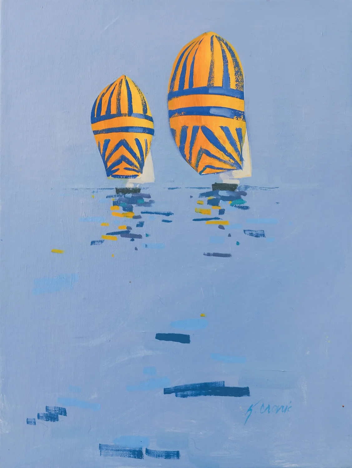
… just last year with a series about sailing!
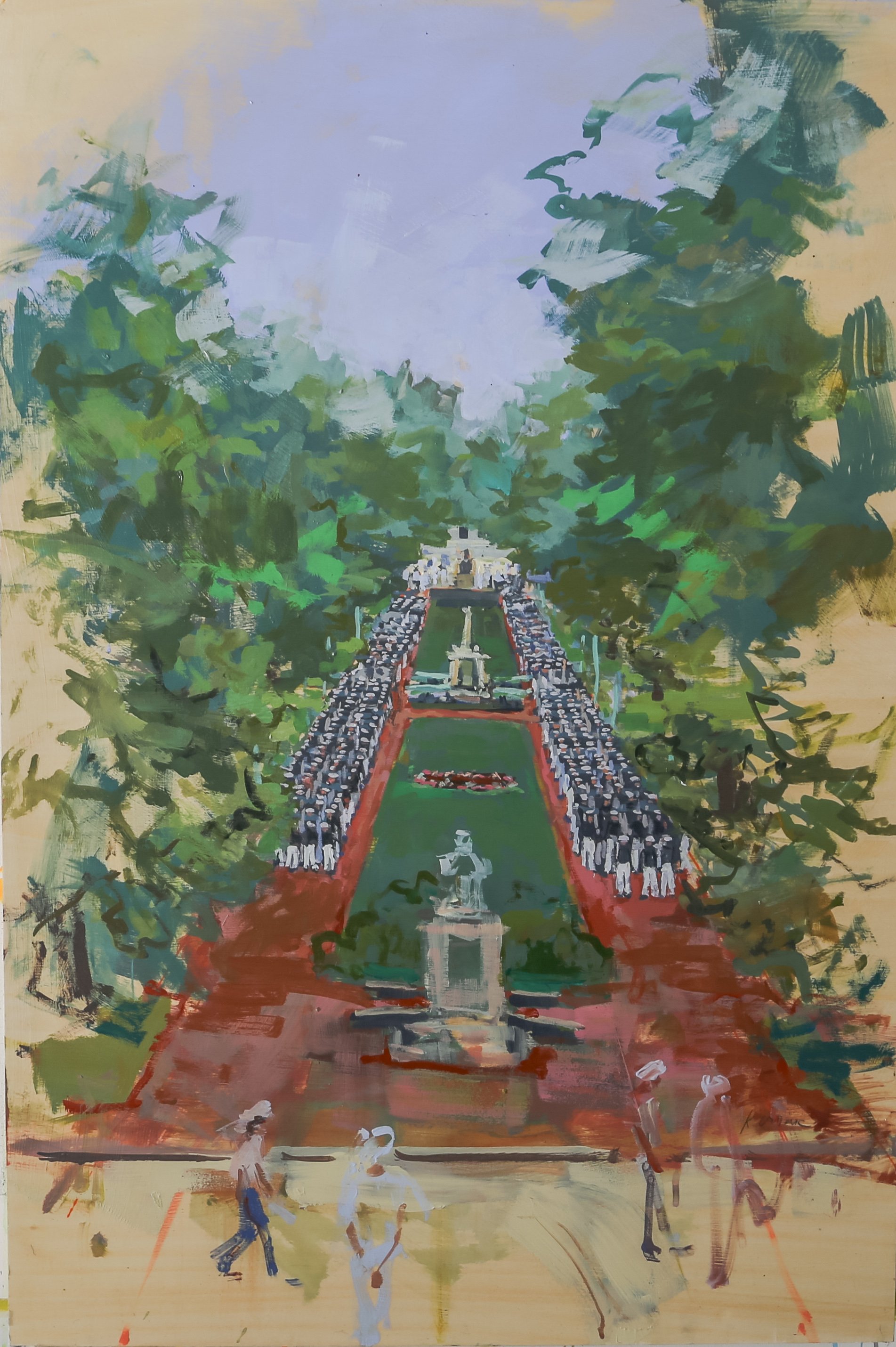
Parade Rest

Small piece from this collection that sparked an entire train of thought. STAY FOCUSED!!!
I’ve wrestled for years with how to depict parades, formations, etc with more visual interest. Though some parade-inspired pieces were set aside during this process, they sparked ideas that might evolve into a full series dedicated to the dynamic energy of marching formations. This piece in particular opened up a train of thought that makes endless rows of people more visually interesting.

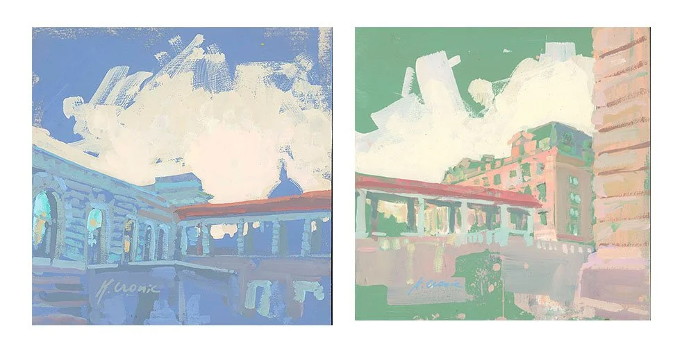
Sketchbook page from that same color theory workshop in March of 2022. Ideas tend to circle a few times before they are fully formed, and I’m finally seeing where this could go!
The funny part was, however- I’ve played with this before. In that same color theory class sketchbook from March of 2022. Creativity always surprises me!
Holiday Inspirations:
I’ve also collected references from Annapolis during the holiday season—charming moments that may someday form their own standalone collection. Or maybe not. There’s always more ideas than there is time :)
Artistic Inspirations
No artist works in a vacuum! We are surrounded by art, visuals, and creativity. It’s impossible to avoid influence, and I wouldn’t want to. Responding to the creative work of others is how artists have grown for millenia. Here are some of the key influences that I referenced when painting Morning Colors:
• The color theory workshop referenced a few times (designed by Scott Gellatly of Gamblin Colors) was instrumental in teaching me how time influences color perception. (You can learn from him here: https://www.scottgellatly.com/workshops )
• Impressionism & Post-Impressionism: Claude Monet and his series of haystacks and cathedrals taught me the power of repeated observations of light. (enjoy reading about them here) Matisse’s Fauvist works inspire me to let color be emotional rather than strictly realistic.
• The approach of alla prima painting—capturing the moment without overworking it—has been a guiding force. I’ve learned from so many artists it’s hard to account. Paul Ladnier, Aimee Erickson, Felicia Forte, and Richard Schmid are just a few.
• Mitchell Johnson uses color itself as content (his words!). For years I’ve been inspired by how much can be said with simple shapes of color. See his work here: https://www.mitchelljohnson.com/
• Contemporary French Artist Jim Drouet simplified backgrounds in a way that encouraged me to strip away distractions. See his work here: https://www.artsy.net/artist/jim-drouet
• Teil Duncan Henley’s incredible sense of color, is endlessly inspiring. “Dahlgren Dawning” reminded me of her palette. I also especially love how she applies her work on textiles products. See Teil’s work here: https://www.teilduncan.com/
Final Thoughts
Every painting and experiment in the Morning Colors series represents a moment of personal discovery and creative perseverance. I hope that through this collection, you feel the same sense of promise and hope that dawn brings every day.
Thank you for being part of this journey. I can’t wait for you to experience Morning Colors in its entirety on launch day. Until then, feel free to reach out with your thoughts or questions
See you on March 25,2025!
FAQ
Originals will be available at this link.
Most paintings are on cradled wood panels ready to hang without the need for framing (work outside of this will be noted in the listing)
Prints will be available after the launch at this link
Commission Policy: I will not be accepting commissions for this series at this time. (If you’re interested in custom work, I can provide referrals through trusted contacts!)
Stay Connected: For any questions or further details, please reach out at hello@easelonstribling.com. Either myself or my amazing partner in crime, Audrey, will get back to you within 1-2 business days!
View the Gallery